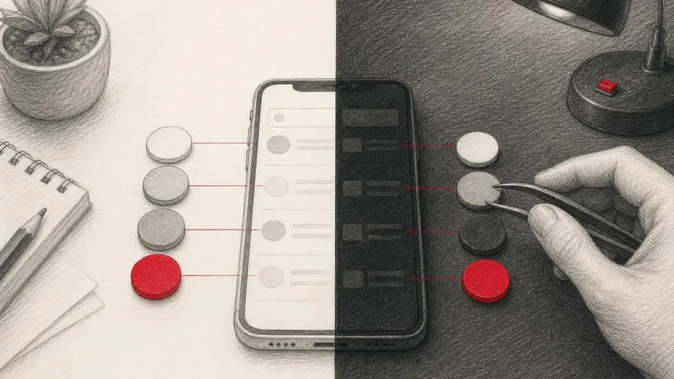
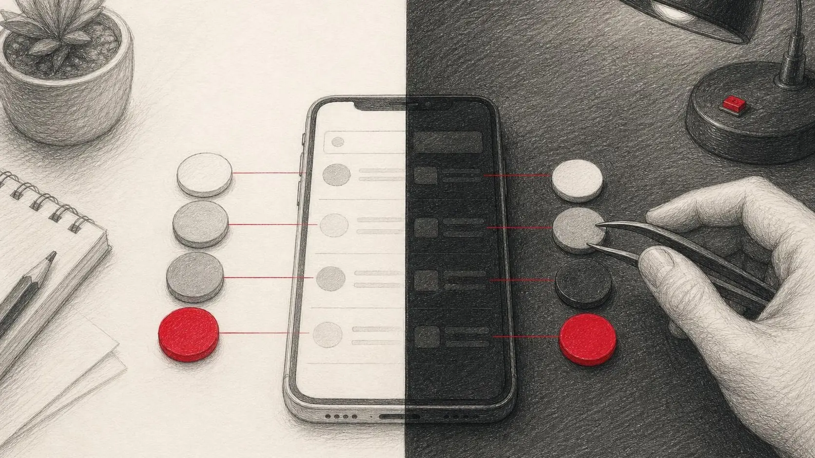
Dark mode is not a colour inversion or a decorative toggle in settings. It has to preserve hierarchy, contrast, readability and clear states across the whole product: from the home screen to the rarely opened account deletion dialog.
System-wide dark mode arrived with iOS 13 and Android 10, and since then users expect apps to adapt automatically. In our projects we regularly see the same picture: dark mode is "added" in a sprint, and then for six months the team fixes invisible borders, "glowing" images and red errors that suddenly became unreadable on a dark background. Here's how to do it once and do it right.
What breaks with a quick inversion
- Grey text loses contrast. A shade that worked well on white can drop below 4.5:1 on a dark background.
- Shadows disappear. On a dark surface a shadow is barely visible, so cards blend into the background unless depth is conveyed another way.
- Borders become too bright or, conversely, vanish entirely.
- Images glare. Illustrations and photos with white backgrounds look like a flashlight in the middle of the screen.
- Statuses lose distinction. Saturated red and green on a dark background either "vibrate" or become too dark.
- Third-party components don't adapt. WebViews, payment SDKs, maps and support chat stay light and break consistency.
Why the same colours don't work on a dark background
Numbers make the strongest case. We calculated the contrast of typical light-theme colours on white and on the #121212 dark surface recommended by Material Design.
| Colour | On white | On #121212 | Verdict |
|---|---|---|---|
| #B00020 (dark "error" red) | 7.33:1 | 2.56:1 | unreadable on dark |
| #2E7D32 (dark "success" green) | 5.13:1 | 3.65:1 | fails for normal text |
| #1976D2 (blue accent) | 4.6:1 | 4.07:1 | borderline; text needs a lighter tone |
| #CF6679 (lighter red) | — | 5.2:1 | suitable for errors in dark mode |
| #90CAF9 (light blue) | — | 10.71:1 | a reliable dark-mode accent |
| White at 60% opacity (secondary text) | — | 7.16:1 | passes |
| White at 38% opacity (disabled) | — | 3.57:1 | acceptable only for inactive states |
The takeaway is simple: every accent and status colour needs a separate, usually lighter and less saturated tone for dark mode. Material Design recommends exactly that — using lighter tones of the palette instead of saturated primaries. We covered contrast thresholds in more detail in our guide to large text, contrast and scaling.
Start with roles, not hex values
Dark mode is impossible to maintain if the code is full of hundreds of specific colours. You need a layer of semantic tokens: surface, elevated surface, primary text, secondary text, border, accent, danger, success, warning. Each token has two values — light and dark — and components reference tokens only.
- iOS provides this out of the box: system colours such as systemBackground, secondarySystemBackground, label and secondaryLabel already adapt to the theme. Custom colours are defined in the Asset Catalog with Any and Dark variants, plus a High Contrast variant.
- Android uses values-night and drawable-night resources and a DayNight-based theme, and in Jetpack Compose darkColorScheme and lightColorScheme in MaterialTheme.
- Depth. Instead of shadows, dark mode conveys elevation with a lighter tone: the higher the element, the lighter the surface. Apple also distinguishes base and elevated backgrounds for modal screens.
- Black or dark grey. Material recommends #121212 instead of pure black: dark grey shows shadows and surface levels, and the extreme contrast of white text on black makes letters look blurry for some people.
Images, illustrations and third-party content
- Prepare separate variants for illustrations and icons, or use vector assets that take their colours from tokens.
- Don't invert photos, but you can slightly reduce their brightness or add a subtle border so they don't "glow".
- Partner logos often exist only in a light version — plan a backing plate for them.
- For WebView on Android 13+, enable algorithmic darkening or pass the theme to the web page through prefers-color-scheme.
- Check whether payment, maps and support SDKs support dark mode and how to configure them.
On energy efficiency: a 2021 Purdue University study showed that on OLED screens, switching to dark mode at 100% brightness saves 39–47% power on average, but at typical 30–50% brightness only 3–9%. So dark mode is primarily about comfort and accessibility, not battery life.
How to check quality
- Walk through key scenarios in both themes, and switch themes in the middle of a scenario: the app must not lose state or entered data.
- Lower screen brightness to the minimum and check that field borders and dividers are visible.
- Turn on larger text and Increase Contrast — dark mode needs a high-contrast variant too.
- Check contrast for the default, disabled, pressed, focus and error states of each component, not a single screenshot.
- Review all images, illustrations and empty states.
- Open every screen with third-party content: WebView, payments, maps, chat.
- Add screenshot tests for both themes so new components don't break the system.
Typical mistakes
- Colours hard-coded inside components, bypassing tokens: these are the first to stay white.
- A toggle only in the app's settings, with no "Match system" option.
- Pure black backgrounds with bright white text in large blocks.
- Saturated brand colours without adaptation, which "vibrate" on a dark background.
- Relying on Android's Force Dark as the final solution: it's a quick start, not design.
- Testing only the home screen while dialogs, bottom sheets and push-driven screens go unchecked.
Implementation checklist
- Create semantic colour tokens and ban hex values inside components.
- Pick dark variants for every accent and status colour with at least 4.5:1 contrast for text.
- Convey depth through surface tone, not just shadow.
- Prepare image variants and backing plates for logos.
- Configure dark mode in WebView and third-party SDKs.
- Add a "Match system" option and make it the default.
- Cover both themes with screenshot tests and a manual pass through key scenarios.
Dark mode is a test of the design system: if the team can't explain a colour's role, it's hard to scale. And the best dark mode doesn't look like a different product — users recognise components, understand statuses and perform the same actions without relearning anything. If the interface has animations, check them too: dark transitions with abrupt brightness jumps are tiring, as we discussed in our article on animation in mobile interfaces.
Sources: Android Developers: What a great user experience looks like; Android Developers: Implement dark theme; Apple Human Interface Guidelines: Dark Mode; Material Design: Dark theme; Purdue University: Dark mode may not save your phone's battery life as much as you think.