An error is the moment when the system fails to keep its promise. "Something went wrong" leaves the user alone with uncertainty: was the money charged, was the request saved, should they tap again? A good message, by contrast, explains the state and helps them move forward.
In our projects we've noticed that error moments are exactly when users most often contact support, leave low ratings and uninstall the app. The cause isn't the error itself — failures happen to everyone — but the fact that the person doesn't understand what happened or what to do. Here's how we design error messages so they preserve trust.
What a message should contain
Nielsen's heuristic #9 frames the task as helping users recognise, diagnose and recover from errors. In practice, a good message answers five questions:
- What happened — in plain words, without jargon: "We couldn't send your order", not "Error 500".
- Whether data was kept — "Your cart and address are saved".
- What to do now — a specific action: "Try again", "Change card", "Check connection".
- Whether to wait — "We'll send it automatically as soon as you're back online".
- Where to get help if the problem persists — with a request ID support can find in the logs.
Don't show a technical code instead of an explanation. The team's log can contain a stack trace and request ID, but the interface must answer the person's questions. A code can sit in small print beneath the explanation — it helps support but doesn't replace the text.
An error map: from technical cause to copy
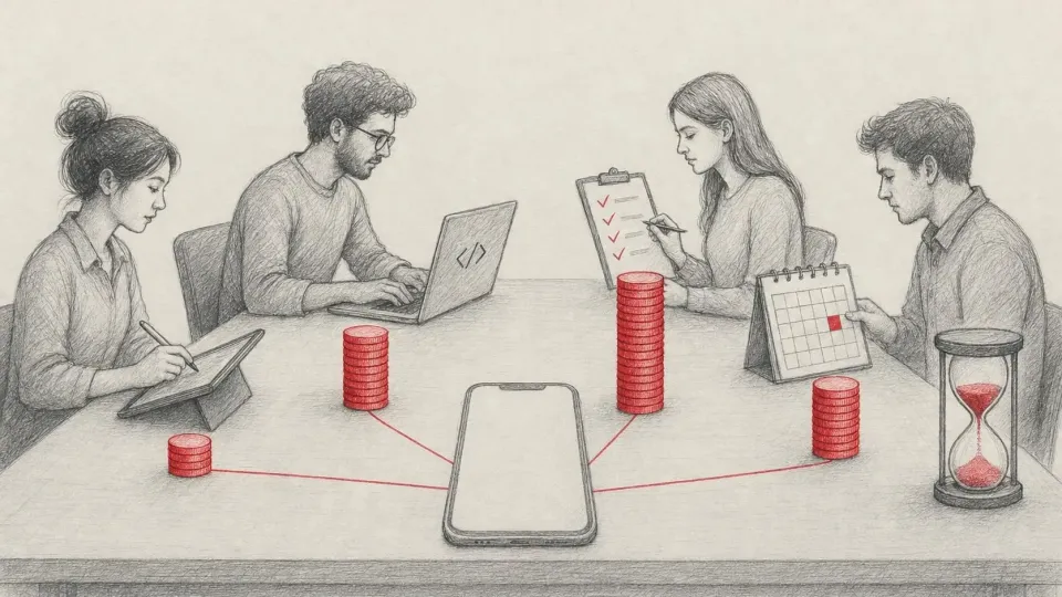
To avoid inventing copy from scratch each time, we build an error map together with backend developers. Here's a baseline version.
| Technical cause | What the user sees | Action in the UI |
|---|---|---|
| No network | "No connection. Your changes are saved on the device" | automatic retry once the network is back |
| Timeout | "The server is taking longer than usual" | "Try again", with no loss of input |
| 401 — session expired | "Sign in again to continue" | re-authentication returning to the same screen |
| 403 — no permission | "You don't have access to this section" | explanation of how to get access |
| 404 — object not found | "This order was deleted or moved" | go to the list |
| 409 — conflict | "The data changed on another device" | show the current version and offer a choice |
| 422 — validation error | text next to the specific field | focus on the first invalid field |
| 429 — too many requests | "Too many attempts. Try again in 30 seconds" | countdown to the next attempt |
| 5xx — server failure | "We're having technical issues and are already on it" | delayed retry, support contact |
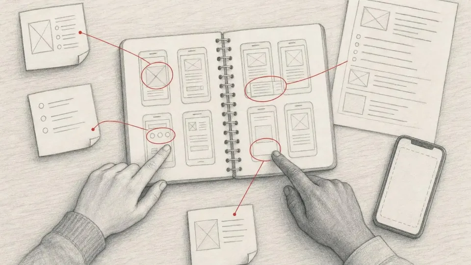
For forms, the most important rule is to show the error next to the field, not as a generic banner at the top. We covered this in detail in our article on mobile forms.
Payments and irreversible actions: three states, not two
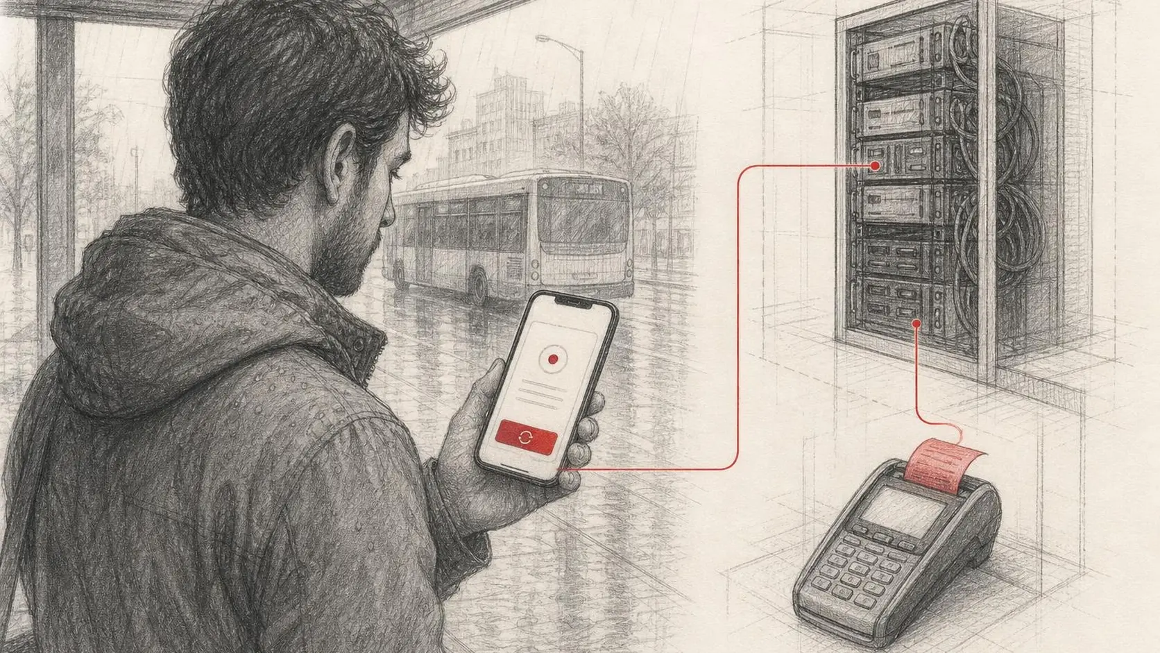
For a payment, file upload or application submission, distinguishing "success" from "error" isn't enough. You need at least three states: "not sent", "processing" and "completed". The most dangerous scenario is a timeout during payment: the customer doesn't know whether the payment went through, while the server may already have processed it.
- Use idempotency keys for payment requests: a repeated tap won't create a second charge.
- Disable the button after the first tap and show the processing status, not just a spinner.
- After a timeout, ask the server for the operation status before offering "Try again".
- For irreversible actions, as WCAG criterion 3.3.4 requires, let users review, confirm or cancel the action.
We discussed how to design the action button itself so it honestly reflects state in our article on the primary action button.
Errors are part of the scenario, not an exception
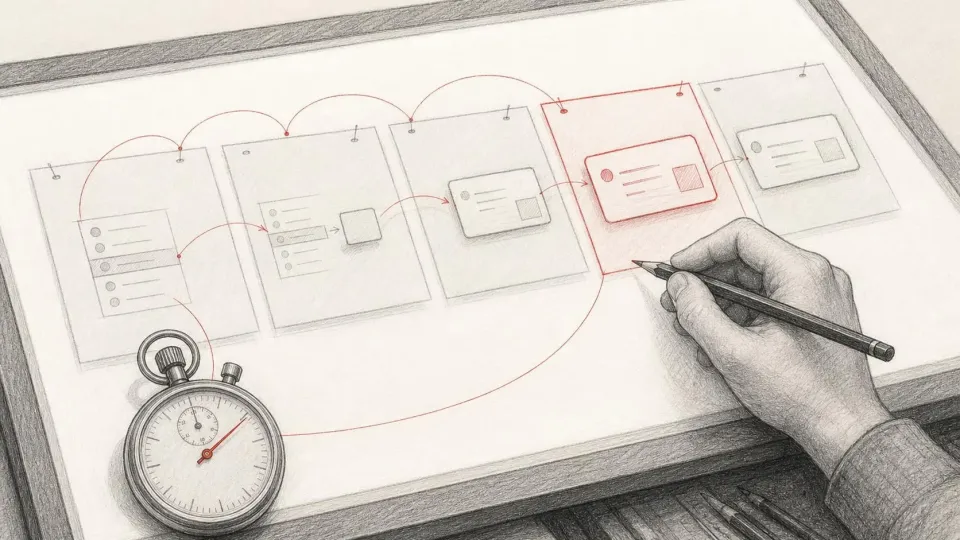
The Gmail Wear OS case study on Android Developers shows the value of measuring real startup and finding bottlenecks: the team replaced an animated spinner with a static image and got a faster start. For error design the lesson is similar — don't hide uncertain states behind an endless spinner. If an operation takes more than a few seconds, show an honest status, and after a reasonable timeout, a clear message and a controlled retry.
Presentation matters too. A transient snackbar is fine for non-critical events ("Couldn't refresh the feed"), but not for data loss or a failed payment: the person may miss it. Critical errors must stay on screen until the user dismisses them, and the screen reader must announce them.
How to write error copy: step by step
- List every error the API can return and group them by user action, not by code.
- For each group, write copy using the formula: what happened + what was saved + what to do.
- Avoid blame: not "You entered the wrong number" but "The number must have 9 digits after +380".
- Check copy length in every language: a long translation must not get truncated.
- Add the request ID to technical details and make it searchable in logs.
- Review the copy together with support: they know what questions customers ask.
How to test errors
Errors rarely make it into the test plan because "everything works in the demo". We add a dedicated pass:
- offline on every key screen and network loss in the middle of an operation;
- slow network with timeouts (Network Link Conditioner on iOS, network emulation in Android Studio);
- double and rapid repeated taps on the submit button;
- session expiry while filling in a form;
- long localised error messages and maximum system font size;
- VoiceOver and TalkBack announcements of errors.
Typical mistakes in error design
- One generic "Something went wrong" message for every case.
- Clearing the form after a server error: the person retypes everything and often gives up.
- An error shown only as a red border with no text — a problem for both accessibility and comprehension.
- An endless spinner instead of a timeout and an explanation.
- A "Try again" button that repeats the same action with the same cause of failure, for example while still offline.
- A jokey tone in critical situations: "Oops! Your money went somewhere" doesn't inspire trust.
Checklist
- There is an API error map with copy and actions for each group.
- Every message explains what happened, what was saved and what to do.
- User input is never lost after an error.
- Payments have three states and idempotent requests.
- Critical errors don't disappear by themselves and are announced by the screen reader.
- Errors are tested offline, on a slow network, with repeated taps and long texts.
- Support can find an error by its request ID.
Trust grows when a product behaves predictably even when it can't perform the desired action. A good error message is a continuation of the service, not an admission of defeat. A broader set of accessibility checks, including for errors, is in our article on mobile app accessibility.
Sources: Android Developers: Gmail Wear OS case study; Nielsen Norman Group: 10 Usability Heuristics; Nielsen Norman Group: Error-Message Guidelines; W3C: Understanding SC 3.3.3 Error Suggestion; Apple Human Interface Guidelines: Alerts; Stripe API: Idempotent requests.